-
Scope: Marketing → Signup → Security → Onboarding
-
Team: 4 design pods, 1 content designer (lead)
-
Audience: New QuickBooks SMB customers
-
Duration: ~6 months
Why we started
Discovery research revealed a critical retention driver: customers who connected their bank accounts within their first session were significantly more likely to stay engaged and succeed.
But connecting a bank early required trust, clarity, and a smoother signup experience, something the old journey didn’t deliver.
-
Early bank connectors were 40 % more likely to stay active after 30 days.
The Challenges
-
Balancing regulatory and security requirements with a simple, confident experience.
-
Helping customers understand and complete financial setup without overwhelm.
-
Aligning copy, flow, and tone across marketing, signup, and in-product surfaces.
My Role
Principal Content Designer and Strategist
I led content and UX writing across the connected journey, collaborating with teams from marketing, pricing, signup/security, and onboarding.
I defined the content strategy, messaging hierarchy, and interaction copy that guided users confidently from website to bank connection.
The Collaboration: A connected journey across four teams
1. Marketing & Signup Experience
We aligned voice and interaction patterns from the first marketing touchpoint through to signup and onboarding.
2. Onboarding & Bank Connection
We embedded the bank connection flow early in onboarding to help customers see value faster.
How we built & tested the content experience
UX Writing Process
We followed a structured process to ensure all content was consistent, clear, and effective across the onboarding journey.
-
Research and discovery: ran qualitative and quantitative studies to understand user behaviours, focusing on their first interactions with QuickBooks.
-
Voice and tone principles: defined a tone that was confident and supportive while balancing regulatory precision with warmth and clarity.
-
Cross-team collaboration: worked closely with marketing, design, product, and compliance to align terminology, messaging patterns, and success metrics across touchpoints.
-
Content prototyping and testing: iteratively tested copy in flows and prototypes to validate comprehension, tone, and clarity.
-
Refinement and governance: documented patterns, created re-usable content structures, and built guidelines to scale consistency globally.
UX Writing Approach
Our approach to language focused on reducing friction, building trust, and helping users see value quickly.
-
Simplify complexity: broke down technical or regulatory content into simple, actionable steps.
-
Guide with clarity: used progressive disclosure and micro-copy to reassure users through each decision.
-
Build confidence: used plain language to explain why certain actions (like connecting a bank) mattered.
-
Consistent tone: maintained a conversational, expert-yet-approachable voice from marketing through onboarding.
-
Evidence-based iteration: refined language using feedback and testing results, ensuring clarity and confidence at every touchpoint.
Key highlight
-
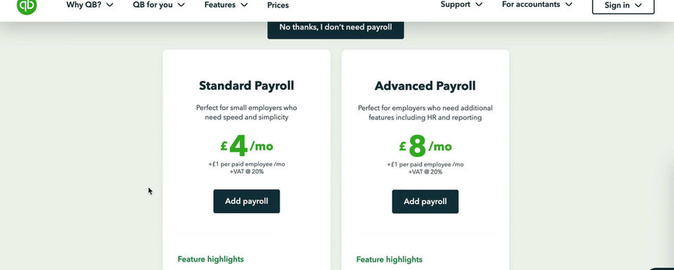
Clear Messaging at Pricing: simplified plan comparison and addressed trust signals early.
-
Regulated Simplicity: guided users through required steps with plain-language explanations.
-
Job-Done Clarity: copy reinforced progress and success at each milestone.
Results
The redesigned onboarding experience delivered measurable improvements in activation, trust, and retention.
-
Improved early engagement: most users connected a bank within the first three minutes of onboarding.
-
+32% increase in 30-day trial-to-subscription conversion (T2S).
-
67% of new customers opted to connect their bank during onboarding, building trust and reducing setup friction.
-
Higher retention: focusing on essential setup tasks in the first 30 days helped customers stay active and succeed faster.
-
Scaled globally: following the success of the UK experience, the new flow was adapted and rolled out across the US, Australia, and Canada.


